
I looked this up after a truncated page with decent comments inspired me – it had only listed Summer Games logos, and being a Canuck the Winter Games are more memorable and more fun. Sadly, this site has no commentary, but it does a good job of showing the chronology of design until its abject collapse in London 2012. That said, a lot of these are forgettable, or would be if they hadn’t been plastered all over memorabilia for the year in which they took place.
For the record, these are my favourite logos:
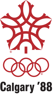
I spent many, many hours frustratedly trying to reproduce this seemingly simple logo. Big C for Canada, little C for Calgary. Snowflake. Lovely.
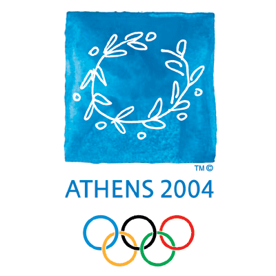
Love the image, love the history, love that blue. Didn’t give a rat’s ass about the Games, though. Oh well. 🙂